
How to Make 3D Prints Accessible: A Blind Maker's Guide to Designing for Everyone
I care about accessible 3D design because a printed object should be usable by the person it is meant for. That sounds obvious, but a lot of designs only work if you can see the photo, guess the scale and adapt yourself to the object.
I am Edis, and I design as a blind maker. That means I think about touch, clear structure, plain descriptions and real handling from the beginning. Accessibility is not decoration. It changes the object.
Why I care about accessible design
One of my most important early projects was a tactile emergency map for my workplace. I wanted a plan that could be understood without relying on sight, with raised routes, clear symbols, text and Braille.
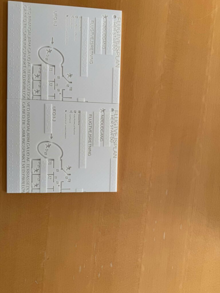
The project reminded me that accessible design rarely helps only one group. A tactile map can help a blind person follow a route, but it can also help someone understand a space faster, explain directions more clearly or feel more confident during a stressful situation.
Start with real use
Before I design an accessible print, I ask what the object needs to do in the real world. Who will use it? How will they hold it? Will it be used once, daily or under pressure? Does it need to survive being dropped, cleaned, carried or explored by touch?
A good accessible print is not just technically printable. It needs to be understandable, durable and comfortable enough to use.
Designing for touch
Tactile features need to be clear. Small raised details can look fine on screen but disappear under a fingertip. I try to make tactile information large enough, spaced enough and distinct enough that it can be read without guessing.
- I use raised lines, symbols and textures with enough spacing between them.
- I avoid sharp edges where fingers will explore the object.
- I make important tactile features proud enough to be felt clearly.
- I test by touch instead of trusting the render.
Braille needs extra care. Dots that are too low, too close or too rough can be hard to read. If Braille is part of the design, I treat it as functional text, not as a decorative texture.
Designing for low vision
Some people use touch, some use remaining vision and many use both. Colour and contrast can make a print easier to understand for people with low vision.
- I prefer strong contrast for important markings.
- I make labels and symbols larger than I would for a purely visual object.
- I avoid relying on small colour differences to carry important information.
- I consider glow-in-the-dark filament only when it actually helps the use case.
Designing for different hands
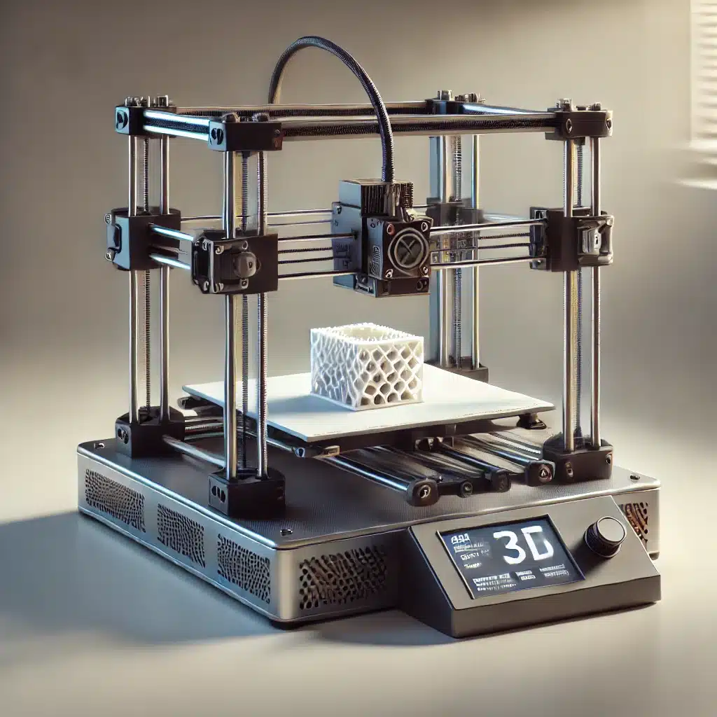
Accessibility is also about grip, strength and movement. A person may have limited hand strength, pain, tremors or only one free hand. 3D printing is useful here because a design can be shaped around a specific need.
- I make handles larger when that improves grip.
- I add texture where slipping would be a problem.
- I avoid tiny parts when a larger part would work better.
- I think about one-handed use when the object allows it.
- I make load-bearing parts strong enough for real handling.
Describe the file properly
A file called thing-final-v3.stl tells me almost nothing. Good descriptions matter, especially for blind makers, but they also help everyone decide whether a model is worth printing.
When I share a model, I try to explain what it is, what size it is, what the important features are and what printing requirements matter. I also describe photos and previews so the page is not only useful to people who can see the images.
- I include real dimensions.
- I describe the shape and purpose of the object.
- I mention material, supports, assembly and any hardware.
- I give images useful alt text instead of relying on the picture alone.
- I use clear file names.
Make the design process accessible
I use OpenSCAD because it lets me design in text. That works better with my screen reader than a design tool built around dragging objects on a visual canvas.
Text-based design also helps with accessibility in another way: measurements, variables and modules can be named clearly. A future version can be changed without hunting around a visual scene for the right face or edge.
- I use descriptive variable names.
- I keep measurements in one place when possible.
- I comment code where the purpose is not obvious.
- I split complicated designs into smaller modules.
- I save versions so I can go back if a change fails.
Test with real people
I can test a lot by touch, but I cannot represent every user. When a design is meant for a specific person or situation, feedback matters. A person who will use the object can tell you things a designer may miss.
My own testing is simple: print a prototype, use it, handle it, ask for feedback, change the design and print again if needed. The first version rarely deserves to be the final version.
Mistakes I try to avoid
- I do not assume one tactile solution works for everyone.
- I do not make details smaller just because they look cleaner.
- I do not sacrifice strength for appearance when the object needs to work.
- I do not rely on a photo when a written description is needed.
- I do not treat accessibility as an afterthought.
Final thoughts
3D printing is powerful because it can solve specific problems. It can make a grip fit one person's hand, turn a visual map into something tactile, or make a game easier for blind and sighted people to play together.
For me, accessible design starts with a simple question: can the person who needs this object actually use it? If the answer is not clear, I keep designing.
The best accessible prints are not special because they look accessible. They are special because they work.
Comments
Leave a comment